Too Many eSIM Plans? The Travel Connectivity UX Problem
Imagine you’re at the airport. Boarding pass ready. Roaming turned off.
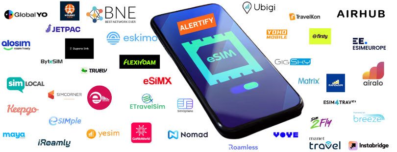
You open an eSIM marketplace to buy a data plan for Europe… and suddenly you’re staring at 87 different options.
One promises 1GB in “Western Europe.”
Another offers “15 countries,” but doesn’t list them until you scroll three screens down.
A third claims to be “regional,” but only works in five countries.
The price difference? A few euros.
What cognitive effort is required to figure out which one will actually work for your trip? Enormous.
Welcome to the UX crisis of travel eSIM marketplaces, where the paradox of choice collides with unclear value and leaves travelers wondering whether this whole system was really designed to make travel easier.
Decision Fatigue Is Real
There’s no doubt that eSIM technology has changed the travel connectivity landscape. No plastic SIM cards, no airport kiosks, and far fewer horror stories of €800 roaming bills. For travelers, the promise of downloading a data plan in seconds is genuinely transformative.
But somewhere along the way, the buying experience has become far more complicated than it needs to be.
Today’s average travel eSIM platform presents a maze of plans organized by country, region, validity period, data limits, and sometimes even vague “speed tiers.” Add to that the fine print surrounding throttling policies, fair-use clauses, or daily limits disguised as “unlimited,” and suddenly a supposedly simple purchase feels like a telecom exam.
The result is classic decision fatigue.
The same psychological trap we experience in the cereal aisle of a supermarket. Fifty boxes, ten flavours, endless labels promising health benefits, and suddenly choosing breakfast feels like a research project.
Travel eSIM marketplaces are starting to look very similar. The more options users see, the more mental energy they spend evaluating them. Instead of feeling empowered, travelers often feel overwhelmed.
And when users feel overwhelmed, they either abandon the purchase or choose randomly. Neither outcome builds trust.
Local? Regional? Global? Pick Your Poison
One of the biggest drivers of confusion in travel eSIM marketplaces is inconsistent labeling.
Imagine a fairly common travel itinerary. You’re heading to Italy, with a day trip planned to Switzerland and maybe a quick detour to France.
You open a marketplace and see the following options:
“Italy Local Plan – 5GB”
“Western Europe – 39 Countries”
“EU Regional eSIM (Excludes Switzerland)”
“Europe+ Plan (Includes Turkey and UK)”
Now the real question begins. Which one actually works for your trip?
What does “Western Europe” mean in this context? Why does one EU plan exclude Switzerland? Why does another Europe bundle include Turkey but not certain EU countries?
These naming conventions may make sense internally to telecom operators and developers managing plan inventories. For the traveler trying to stay connected during a trip, they are deeply confusing.
Even worse, many platforms offer very limited filtering tools. Want to find plans that work in both Italy and Switzerland quickly? On many sites, you cannot simply select both countries and see compatible options.
Instead, you are expected to open individual plans, scroll through country lists, download PDFs, or dig through long descriptions.
At that point the platform is no longer simplifying travel connectivity. It is recreating the exact complexity it promised to remove.
Too Much Tech, Not Enough Human
Another major pitfall in the travel eSIM space is how overly technical the whole experience has become. Don’t get us wrong—eSIMs are a technological marvel. But the average traveler doesn’t care about “APN configuration,” “ICCID profiles,” or whether a plan is “prepaid data-only with no voice fallback.”
They just want one thing: Will this work on my trip?
Sadly, too many platforms prioritize tech specs over travel relevance. Instead of asking users basic questions like:
- Where are you going?
- How long will you stay?
- What do you use your phone for (maps, video, messages)?
…they throw you straight into a wall of plans, assuming you’ll just know what “validity: 30 days from activation” or “500MB/day at 4G, then 2G speeds” means.
Spoiler: Most people don’t.
That’s why airlines and OTAs that enter the eSIM game with smarter UX flows are starting to win. They embed travel context right into the buying process. Some even bundle eSIMs as add-ons post-booking, removing friction entirely.
The “Best Value” Illusion
Here’s another UI/UX trap: the “Best Value” badge.
Everyone wants to save money. So many marketplaces slap a bright yellow “Best Value” tag on plans that offer slightly more data, or a longer validity. But without context, that’s just smoke and mirrors.
Let’s say one plan is €12 for 5GB and another is €15 for 10GB. The latter might seem like the better deal—until you realize you’re only in the country for 3 days and won’t use more than 2 GB.
True “best value” is personal, not universal. A better approach would be to ask a few short questions and recommend the right plan, not just the biggest one. Think Netflix- or Spotify-style onboarding—quick, smart, and user-friendly.
Unfortunately, most current eSIM sites take a “catalog approach” that puts all the decision-making burden on the user. That’s not convenience—that’s a crash course in telecom lingo.
Traveler-first onboarding
Start with context. Where are you traveling? How long will you stay? Will you mostly use maps, social media, or video calls? A few simple questions can instantly eliminate most irrelevant plans.
Plain language instead of telecom terminology
Replace technical descriptions with travel-relevant explanations, such as “Great for a one-week trip in Italy and nearby countries” or “Works across 38 European destinations, including Switzerland.”
Smart filtering and comparison
Allow users to select multiple countries and immediately see compatible plans. Provide clear side-by-side comparisons covering coverage, speed expectations, validity, and price.
Transparency and trust
Coverage maps should be interactive and easy to read. Roaming exclusions should never be hidden in fine print. Reviews should reflect real travel experiences rather than generic star ratings.
Personalized recommendations
This is where AI can genuinely improve the experience. By learning from past purchases, trip patterns, or device types, platforms can recommend the most relevant plans rather than forcing users to search manually.
The Bigger Picture
The eSIM revolution is still in its early stages. As roaming regulations evolve and more smartphones ship without physical SIM trays, digital connectivity marketplaces will continue to grow rapidly.
That means the next wave of competition will not be defined only by price or coverage.
It will be defined by clarity.
Platforms that continue to display hundreds of telecom bundles without context will struggle to retain user trust. Those that translate telecom complexity into simple travel decisions will stand out.
Ironically, the technology itself already solved the hardest problem. Delivering connectivity without physical hardware.
Now the challenge is much simpler.
Designing marketplaces that make choosing that connectivity easy.
Because when you are standing at the airport gate five minutes before boarding, you do not want to compare eighty-seven data plans.
You want one clear recommendation that says:
This is the plan that will work for your trip.